Brand identity and packaging design for a craft gin from Canada’s west coast.
Great brand identities often begin with a simple observation.
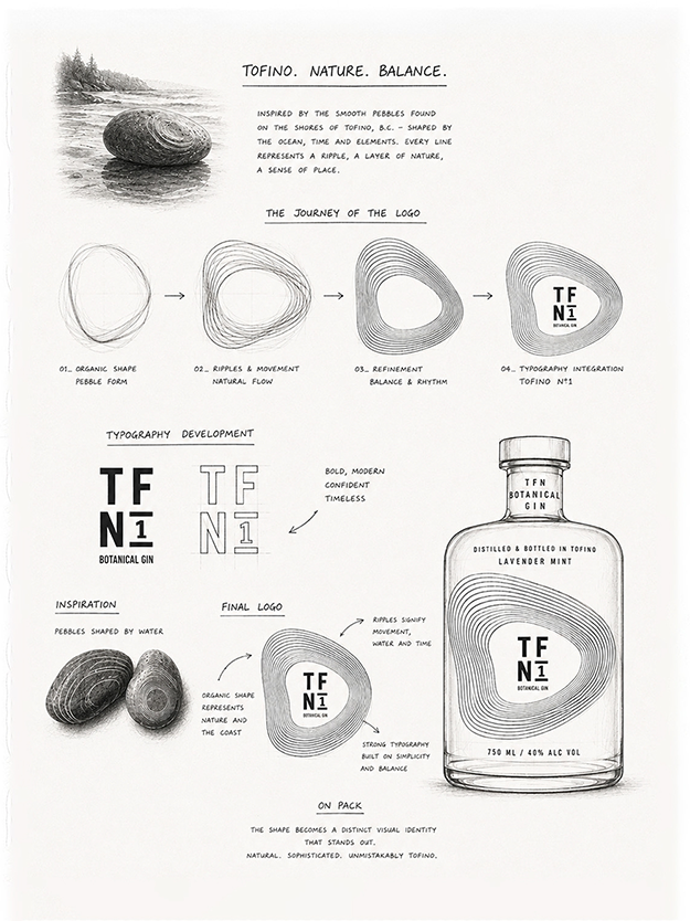
For Tofino Nº1, that observation was a pebble—smoothed over time by the movement of the Pacific and shaped by the landscape of Vancouver Island. Its imperfect, organic form became the starting point for a visual identity rooted in place, movement and transformation.
Naming: grounding a spirits brand in place
The brand naming works the same way. Tofino anchors the gin to a specific stretch of coastline; Nº1 marks a beginning—the first expression in a range, and a quiet nod to the batch numbering of small-scale distilling. Shortened to TF Nº1, it becomes something closer to a signature.
Logo design: from pebble to contour
Through a process of sketching and reduction, the pebble evolved into a series of fluid, concentric contours. Part shoreline, part ripple, part topographic study, the resulting logo feels inherently natural while remaining distinctly graphic. At its centre, the structured TF Nº1 monogram creates tension between the organic and the precise.
A colour palette built on contrast
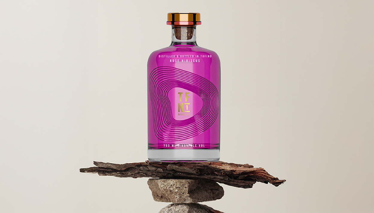
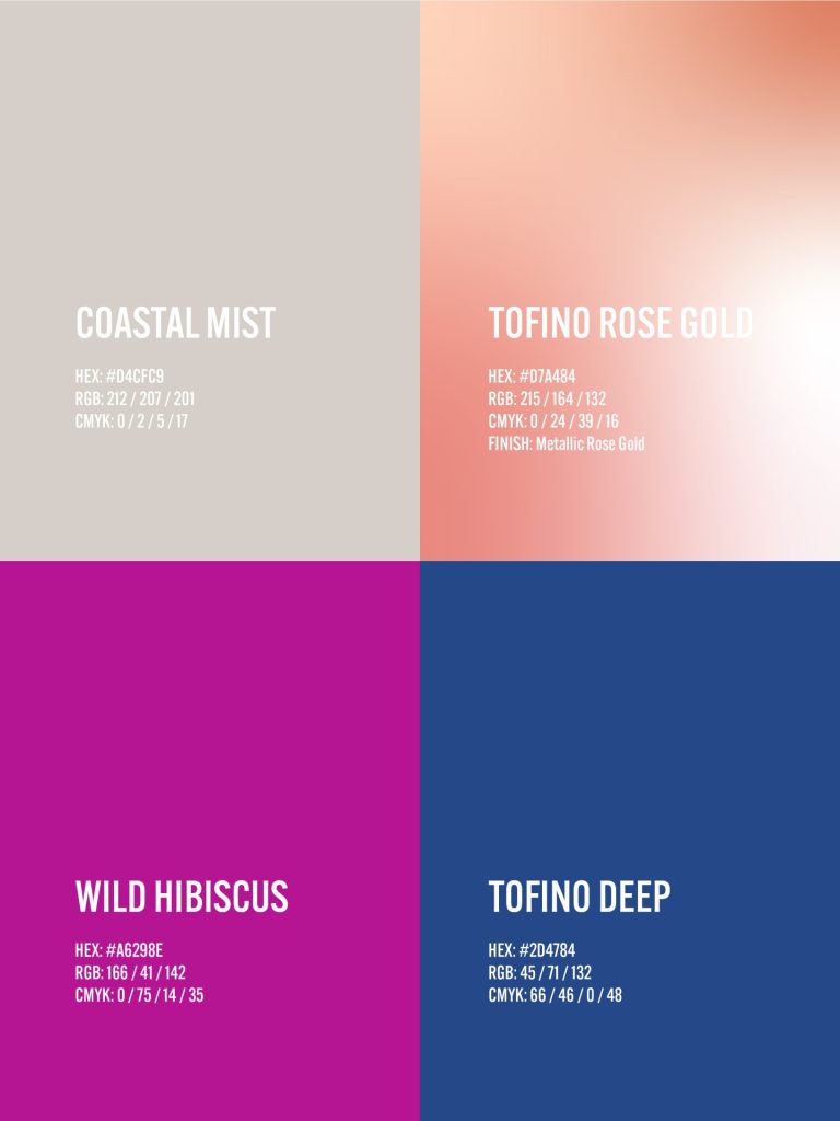
That contrast carries throughout the brand identity. A restrained palette of Coastal Mist and metallic Rose Gold is disrupted by saturated Hibiscus and deep Pacific Blue, bringing an unexpected confidence to a category that so often defaults to heritage cues. Where the two colours meet, a hard horizon cuts straight through the contours—a simple structural device that lets the system shift from calm to bold without losing coherence.
Packaging design: making the mark tactile
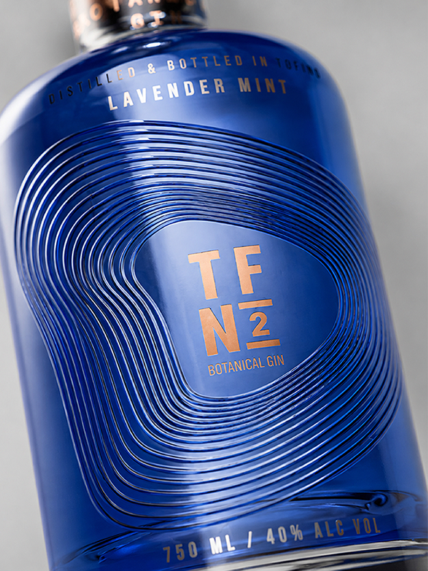
On the bottle, the graphic moves beyond print to become an embossed, tactile surface, allowing light, glass and shadow to continually reinterpret the mark. The Rose Gold closure and frosted base complete the object, while the label reads as a single continuous field rather than a panel applied to glass.
The system was built to extend. Tofino Nº2 Lavender Mint carries the same contour mark into Tofino Deep blue with a Rose Gold monogram—proof that the packaging design can shift flavour, colour and expression without ever losing recognition on shelf.
The result is a packaging and identity system designed not simply to reference Tofino, but to capture something of its character: elemental, sophisticated, quietly unexpected and shaped by the forces around it.